
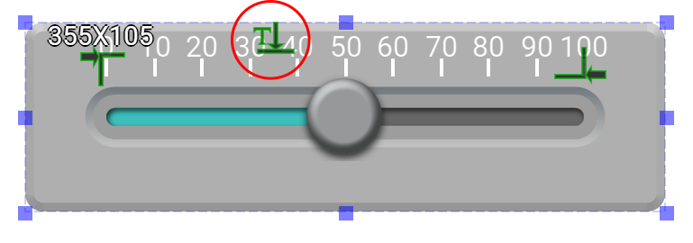
Horizontal Slider is an input/output widget. When the knob is enabled, this widget is an input one; otherwise, it is an output widget.
This widget allows users to load images for the background, liquid column, knob, and bore. It also allows users to set style for the scale.
An educational vidoe is availble to get users started:
-
Educational Video
Widget Property
Hoirzontal Slider
| Property | Description | Operation |
|---|---|---|
| Widget Name | Widget displayed name | Name |
| Link to User Manual | Link to IOT’s website for User Manual |
Visibility Control
| Property | Description | Operation |
|---|---|---|
| Binding Hidden Control Register | Select a binding register to control the visibility of this widget | Checkbox |
| Hidden Control Register | Choose a binding regsiter | Register Selector |
Background Image Setting
| Property | Description | Operation |
|---|---|---|
| Show Image | Show the background image | Checkbox |
| Show Handler | Show the handler for the background image The handlers indicates the outline and the center point of the widget. |
Checkbox |
| Load Image | Load an image from the file system as the background | File Open Dialog Box |
| Edit Image | Edit the background image | Image Editor Dialog Box |
| Paste Image | Paste an image from the clipboard as the background |
Liquid Column Image Setting
| Property | Description | Operation |
|---|---|---|
| Show Image | Show the liquid column image. This image moves according to the value of the binding register of the widget Checkbox | |
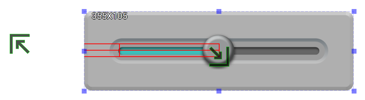
| Show Handler | Show the handler of the liquid column Users can use this handler to adjust the position and width of the liquid column. |
Checkbox |
| Liquid Column Top Left | Set the coornidate values for the top-left corner of the liquid column This feature is available only when the Handler is enabled. |
Alignment Selector |
| Liquid Column Bottom Right | Set the coordinate values for the bottom-right corner of the liquid column This feature is available only when the Handler is enabled. |
Alignment Selector |
| Load Image | Load an image from the file system as the liquid column | File Open Dialog Box |
| Edit Image | Edit the liquid column image | Image Editor Dialog Box |
| Paste Image | Paste an image from the clipboard as the liquid column |
Knod Image Setting
| Property | Description | Operation |
|---|---|---|
| Show Image | Show the knob image | Checkbox |
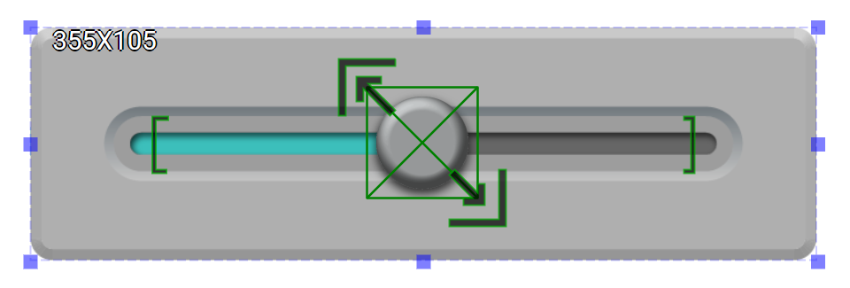
| Show Handler | Show the handler for the knob. Users can use this handler to adjust the starting and ending point of the knob as well as the size of the knob. |
Checkbox |
| Knob Top Left | Set the coordinate values for the top-left corner of the knob This feature is available only when the Hander is enabled. |
Alignment Selector |
| Knob Bottom Right | Set the coordiante values for the bottom-right corner of the knob This feature is available only when the Handler is enable. |
Alignment Selector |
| Load Image | Load an image from the file system as the knob | File Open Dialog Box |
| Edit Image | Edit the knob image | Image Editor Dialog Box |
| Paste Image | Paste an image from the clipboard as the knob |
Bore Image Setting
| Property | Description | Operation |
|---|---|---|
| Show Image | Show the bore image | Checkbox |
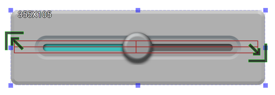
| Show Handler | Show the handler of the bore Users can use this handler to adjust the bore’s position and width. |
Checkbox |
| Bore Top Left | Set the coordinate values for the top-left corner of the bore This feature is available only when the Hander is enabled. |
Alignment Selector |
| Bore Bottom Right | Set the coordiante values for the bottom-right corner of the bore This feature is available only when the Handler is enable. |
Alignment Selector |
| Load Image | Load an image from the file system as the bore | File Open Dialog Box |
| Edit Image | Edit the bore image | Image Editor Dialog Box |
| Paste Image | Paste an image from the clipboard as the bore |
Scale Setting
| Property | Description | Operation |
|---|---|---|
| Enable Scale | Enable scale on this widget | Checkbox |
| Tick Head Style | Select the tick head style to be round or square | Dropdown List |
| Enable Scale Stencil | Enable stencil on the scale If enabled, scales display the color of the behind image. |
Checkbox |
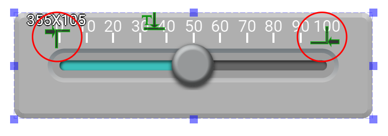
| Mark Start Location | Set the starting point’s coordinates This feature is available only when scales are enabled. |
Alignment Selector |
| Mark End Location | Set the ending point’s coordinates This feature is available only when scales are enabled. |
Alignment Selector |
| Tick Granularity | Select the granularity for the ticks | Number Editor |
| Tick Color | Select a color for the ticks | Color Selector |
| Tick Style | Select a line style for the ticks | Frame Selector |
| Enable Sub Tick | Enable the sub ticks | Checkbox |
| Sub Tick Granularity | Select the granularity for the sub ticks | Number Editor |
| Sub Tick Color | Select a color for the sub ticks | Color Selector |
| Sub Tick Style | Select a line style for the sub ticks | Frame Selector |
| Sub Tick Length as % | Set the sub ticks’ length as a percentage (1-100%) of the ticks | Number Editor |
| Display Number | Display numbers on the scales | Checkbox |
| Starting Number | Set the value for the starting number of the scales | Number Editor |
| Ending Number | Set the value for the ending number of the scales | Number Editor |
| Alignmnet | Select an alignment method | Alignment Selector |
| Number Font | Set the font style | Font Selector |
| Number Color | Select a color for the numbers | Color Selector |
Knob Behavior Setting
| Property | Description | Operation |
|---|---|---|
| Minimum Data Value | The starting point value for the knob | Number Editor |
| Maximum Data Value | The ending point value for the knob | Number Editor |
| Reversed Value Mapping | Reversing the mapping for the knob Minimum Data Value is mapped to the ending point of the knob whereas Maximum Data Value is mapped to the starting point of the knob. |
Checkbox |
| Value Binding Register | Bind a register for the knob | Register Selector |
Preview
| Property | Description | Operation |
|---|---|---|
| Animate | The knob move throughout the entire range simulating the change of the binding register’s value. |
On-Widget Editor
| Property | Description | Operation |
|---|---|---|
 |
Adjust the liquid column’s position and width | Liquid Column Editor |
 |
Adjust the knob’s starting and ending positions and the size | Knob Editor |
 |
Adjust bore’s position and width | Bore Editor |
 |
Adjuist tick’s position | Scale Editor |
 |
Adjust cale number’s position | Scale Editor |
Right-Click Menu
Tick Head Style
| Property | Description | Operation |
|---|---|---|
| Tick Head Style | Set the tick head style to be round or square |
Display Number
| Property | Description | Operation |
|---|---|---|
| Display Number | Set to display the numbers on the scales | Checkbox |
Alignment
| Property | Description | Operation |
|---|---|---|
| Alignment | Select the alignment method | Alignment Selector |
Reversed Value Mapping
| Property | Description | Operation |
|---|---|---|
| Reversed Value Mapping | Rseversing the value mapping for the knob | Checkbox |
Widget-Specific Actions
| Property | Description | Operation |
|---|---|---|
| Load Backgrond Image… | Load an image from the file system as the background | File Open Dialog Box |
| Edit Background Image | Edit the background image | Image Editor Dialog Box |
| Paste to Background Image from Clipboard | Paste an image from Clipboard as the background image | |
| Load Liquid Column Image… | Load an image from the file system as the liquid column | File Open Dialog Box |
| Edit Liquid Column Image | Edit the liquid column image | Image Editor Dialog Box |
| Paste to Liquid Column Image from Clipboard | Paste an image from Clipboard as the liquid colum | |
| Load Knob Image… | Load an image from the file system as the Knob | File Open Dialog Box |
| Edit Knob Image | Edit the knob image | Image Editor Dialog Box |
| Paste to Knob Image from Clipboard | Paste an image from clipboard as the knob | |
| Load Bore Image… | Load an image from the file system as the bore | File Open Dialog Box |
| Edit Bore Image | Edit the bore image | Image Editor Dialog Box |
| Paste to Bore Image from Clipboard | Paste an image from the clipboard to the bore | |
| Preview Press Animation | Preview the widget by automatically moving the knob | |
| Link to User Manual… | Connect to the education video and play it |