Circular Gauge is an input/output widget
As an output widget, this widget offers a complete set of meters. As an input widget, it can combine with the cicular needle and proper background to perform a turning knob function.
An educational vidoe is availble to get users started:
Property
Description
Operation
Widget Name
Widget displayed name
Name
Link to User Manual
Link to IOT’s website for User Manual
Property
Description
Operation
Binding Hidden Control Register
Select a binding register to control the visibility of this widget
Checkbox
Hidden Control Register
Choose a binding regsiter
Register Selector
Property
Description
Operation
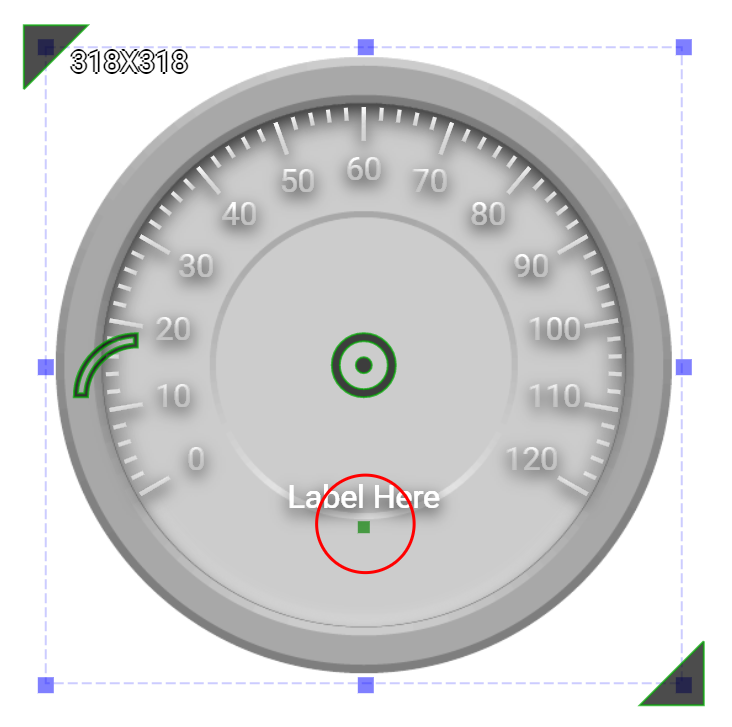
Display Text
Display Text Label
Checkbox
Text
The content of the text label
Plain Text
Font
Set the typeface, font size, baldness, italics and line space for the text
Font Selector
Text Color
Select a color for the text label
Color Selector
Text Location
Set the coordinate values for the text label
Alignment Selector
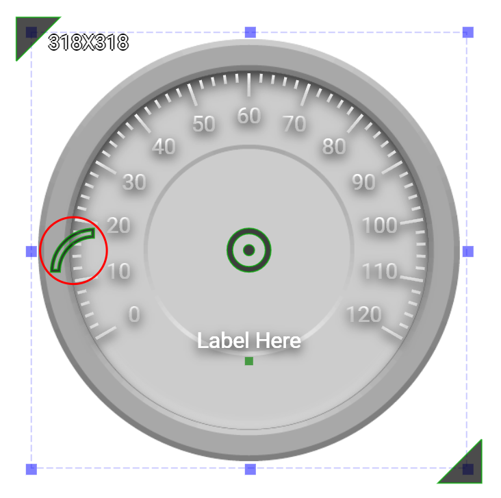
Start Number
Starting number for the circular scale
Number Editor
End Number
Ending number for the circular scale
Number Editor
Reversed Scales
Checked to reverse the progression of the scale.
Checkbox
Start Angle
Set the angle(1-359) for the starting point of the scale. Please refer to Number Editor
Number Editor
Arc Length
Set the arc length in degrees(1-360)
Number Editor
Property
Description
Operation
Minimum Data Value
Set the minimum value that represents the starting value of the circule scales. This valume must be smaller than the maximum value of the binding register.
Number Editor
Maximum Data Value
Set the maximum value that represents the end value of the circule scales. This valume must be larger than the minimum value of the binding register.
Number Editor
Binding Register
Select a register of which value is represented by the needle
Register Selector
Needle Top Left
Set the coordinate value for the top-left corner of the needle
Alignment Selector
Needle Bottom Right
Set the coodinate value for the bottom-right corner of the needle
Alignment Selector
Enable Slider Knob
Onced enabled, this knob can be used to change the value of the binding register
Checkbox
Load Needle Image
Load an image from the file system as the needle
File Open Dialog Box
Property
Description
Operation
Display Outline
Display outline
Checkbox
Border Color
Select a color for the border
Color Selector
Border Style
Select a line style for the border
Dropdown List
Fill Color
Select a color for the outline
Color Selector
Property
Description
Operation
Show Background Image
Show the background image
Checkbox
Image Top Left
Set the image’s top-left coordinates
Alignment Selector
Image Bottom Right
Set the image’s bottom-right coordinates
Alignment Selector
Load Background Image
Load an image from the file system as the background
File Open Dialog Box
Property
Description
Operation
Enable Scale
Enable the scales for 1st Tick
Checkbox
Tick Granularity
Set the tick’s granularity
Number Editor
Tick Start Radius
Set the tick’s starting position as a percentage (1-200%) of the radius
Number Editor
Tick End Radius
Set the tick’s ending position as a percentage (1-200%) of the radius
Number Editor
Tick Color
Select a color fot the ticks
Color Selector
Tick Style
Set the tick style
Frame Selector
Display Number
Display number on the ticks
Checkbox
Display Start Number
Display the starting number
Checkbox
Display End Number
Display the ending number
Checkbox
Text Start Radius
Set the number’s position as a percentage of the radius (1-200%)
Number Editor
Number Font
Set the typeface, font size, baldness, italics for the display number
Font Selector
Number Color
Select a color for the display number
Color Selector
Property
Description
Operation
Enable Scale
Enable the scales for 2nd Tick
Checkbox
Tick Granularity
Set the tick’s granularity
Number Editor
Tick Start Radius
Set the tick’s starting position as a percentage (1-200%) of the radius
Number Editor
Tick End Radius
Set the tick’s ending position as a percentage (1-200%) of the radius
Number Editor
Tick Color
Select a color fot the ticks
Color Selector
Tick Style
Set the tick style
Frame Selector
Display Number
Display number on the ticks
Checkbox
Display Start Number
Display the starting number
Checkbox
Display End Number
Display the ending number
Checkbox
Text Start Radius
Set the number’s position as a percentage of the radius (1-200%)
Number Editor
Number Font
Set the typeface, font size, baldness, italics for the display number
Font Selector
Number Color
Select a color for the display number
Color Selector
Property
Description
Operation
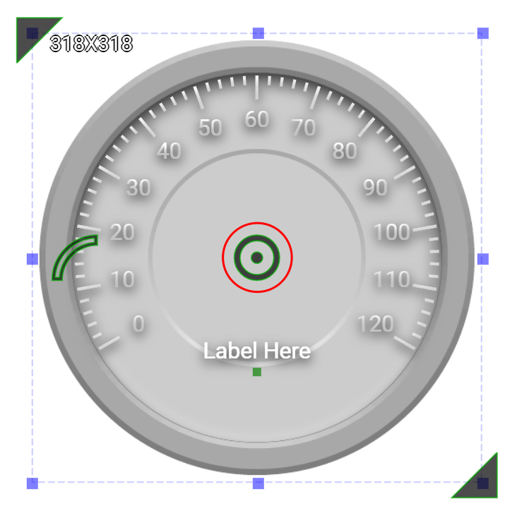
Move to Center
Move the center of the circle to the central point of the widget
Center Editor
Property
Description
Operation
Tick Style
Select a style for the ticks. Please refer to Color Selector
Property
Description
Operation
Tick Head Style
Select a style for the tick head
Property
Description
Operation
Load Background Image…
Load an image from the file system as the background
File Open Dialog Box
Paste to Background Image from Clipboard
Paste an image from Clipboard as the background
Edit Back Ground Image
Edit the background image
Image Editor Dialog Box
Link to User Manual…
Connect to the education video and play it