Data Chart is an output widget. This widget draws line graph/chart according to the input data. It provides flexible settings such as background color, foreground colors, grid granularity and so on.
An educational vidoe is availble to get users started:
Property
Description
Operation
Widget Name
Widget displayed name
Name
Link to User Manual
Link to IOT’s website for User Manual
Property
Description
Operation
Binding Hidden Control Register
Select a binding register to control the visibility of this widget
Checkbox
Hidden Control Register
Choose a binding regsiter
Register Selector
Property
Description
Operation
Show Protractor
Show the protractor
Checkbox
Show Background Image
Show the background image
Checkbox
Show Grid
Show the grids
Checkbox
Load Background Image
Load an image from the file system as the background
File Open Dialog Box
Property
Description
Operation
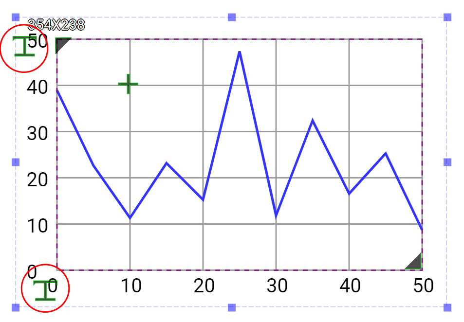
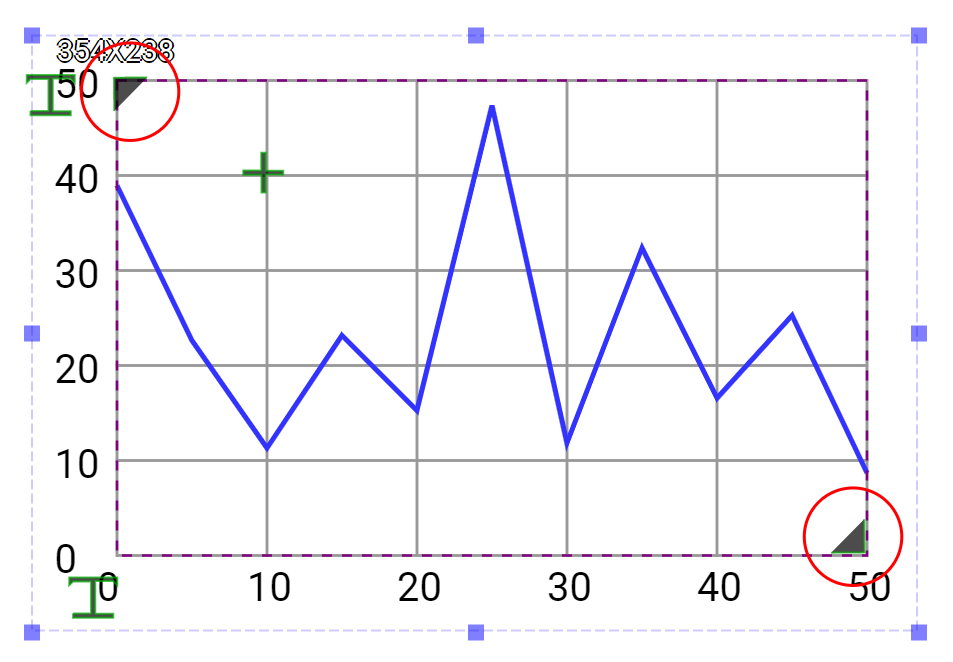
Top Left Corner
Set the coordinate values for the top left corner
Alignment Selector
Bottom Right Corner
Set the coordinate values for the bottom right corner
Alignment Selector
Data Update Mode
Set the data update mode to be circulr or shift mode
Dropdown List
Char Display Type
Set the chart to be line, column, point or area mode
Dropdown List
Data Series Opacity %
Set the data serise opacity (0-100%)
Number Editor
Data Series Width
Set the data chart width
Number Editor
Data Series Point Count
Set the data point number on X-Axis
Number Editor
Maximum Data Value
Set the maximum data value for the Y-Axis
Number Editor
Minimum Data Value
Set the minimum data value for the Y-Axis
Number Editor
Property
Description
Operation
Grid Granularity
Set the grid granularity
Alignment Selector
Grid Background Color
Select a color for the grid background
Color Selector
Grid Line Color
Select a color for the grid lines
Color Selector
Grid Line Style
Select a line style for the grid lines
Frame Selector
Property
Description
Operation
Show Horizontal Scale
Show the horizontal scale
Checkbox
Font
Set the font’s type, size, style and line space
Font Selector
Text Color
Select a color for the texts
Color Selector
Starting Number
Set the starting number
Number Editor
Granularity
Set the granularity for increasement or decreasement. If the value is set to be minus, it is treated as the decreasement.
Plain Text
Location
Set the location of the horizontal scales
Alignment Selector
Property
Description
Operation
Show Vertical Scale
Show the Vertical scale
Checkbox
Font
Set the font’s type, size, style and line space
Font Selector
Text Color
Select a color for the texts
Color Selector
Starting Number
Set the starting number
Number Editor
Granularity
Set the granularity for increasement or decreasement. If the value is set to be minus, it is treated as the decreasement.
Plain Text
Location
Set the location of the vertical scales
Alignment Selector
Property
Description
Operation
Grid Shadow Dx
Set the grid shadow’s X-axis value
Number Editor
Grid Shadow Dy
Set the grid shadow’s Y-axis value
Number Editor
Grid Shadow Color
Select a color for the brid shadow
Color Selector
Property
Description
Operation
Enable Data Series 1
Enable Data Series 1
Checkbox
Binding Register
Set the binding register of which value is shown by the data serier 1 chart
Register Selector
Color
Select the color for Data Series 1
Color Selector
Property
Description
Operation
Enable Data Series 2
Enable Data Series 2
Checkbox
Binding Register
Set the binding register of which value is shown by the data serier 2 chart
Register Selector
Color
Select the color for Data Series 2
Color Selector
Property
Description
Operation
Enable Data Series 3
Enable Data Series 3
Checkbox
Binding Register
Set the binding register of which value is shown by the data serier 3 chart
Register Selector
Color
Select the color for Data Series 3
Color Selector
Property
Description
Operation
Enable Data Series 4
Enable Data Series 4
Checkbox
Binding Register
Set the binding register of which value is shown by the data serier 4 chart
Register Selector
Color
Select the color for Data Series 4
Color Selector
Property
Description
Operation
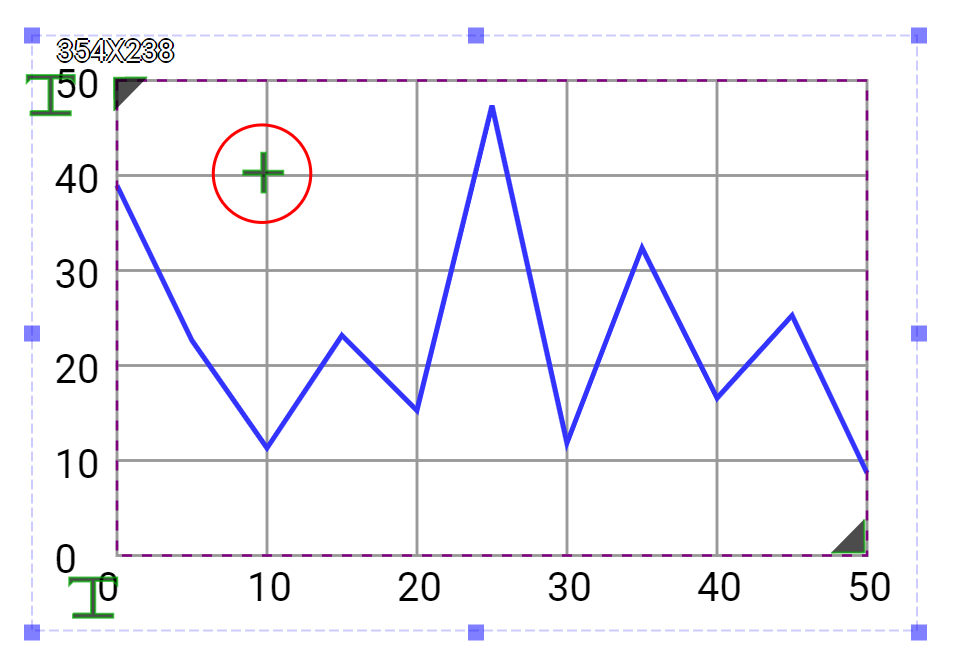
Set the locations of Horizontal Scales and Vertical Scales
Set the chart size and location
Set the grid granularity
Property
Description
Operation
Reset Ratio by Width
Reset the size of the widget based on the original widget ratio with width unchanged
Reset Editor
Reset Ratio by Height
Reset the size of the widget based on the original widget ratio with height unchanged
Reset Editor
Load background Image…
Load an image from the file system as the background
File Open Dialog Box
Link to User Manual…
Connect to the education video and play it