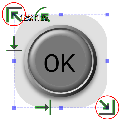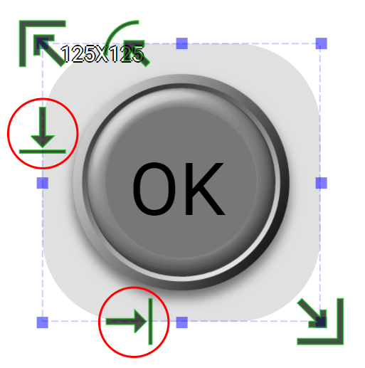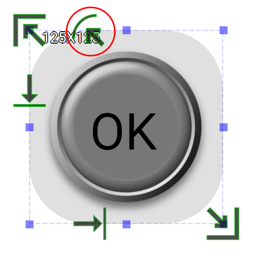
Click Button is an input widget. It does not have any retained state. Instead, it has the click event that can be set/programmed to the desired behavior.
-
Educational Video
Widget Property
Click Button
| Property | Description | Operation |
|---|---|---|
| Widget Name | Widget displayed name | Name |
| Link to User Manual | Link to IOT’s website for User Manual |
Visibility Control
| Property | Description | Operation |
|---|---|---|
| Binding Hidden Control Register | Select a binding register to control the visibility of this widget | Checkbox |
| Hidden Control Register | Choose a binding regsiter | Register Selector |
Stencil Negative Setting
| Property | Description | Operation |
|---|---|---|
| Shape | Choose the stencil shape | Dropdown List |
| State | Select the preview state | Dropdown List |
Released State Text Setting
| Property | Description | Operation |
|---|---|---|
| Display Text | Select whether to display the off-state text | Checkbox |
| Enable Text Stencil | Select whether to apply stencil to the text | Checkbox |
| Text | Enter the off-state text to be displayed | Plain Text |
| Font | Select text typeface, font size, style and line space | Font Selector |
| Text Color | Select the text color | Color Selector |
| Alignment | Select alignment | Alignment Selector |
| Blending Mode | Select the color blending mode for the text and the background. Please refere to Blending Selector If Stencil is enabled, the blending mode is invalid. |
Blending Selector |
| Stencil Negative Color | Select the stencil negative color. | Color Selector |
Pressed State Text Setting
| Property | Description | Operation |
|---|---|---|
| Display Text | Select whether to display the off-state text | Checkbox |
| Enable Text Stencil | Select whether to apply stencil to the text | Checkbox |
| Text | Enter the off-state text to be displayed | Plain Text |
| Font | Select text typeface, font size, style and line space | Font Selector |
| Text Color | Select the text color | Color Selector |
| Alignment | Select alignment | Alignment Selector |
| Blending Mode | Select the color blending mode for the text and the background. Please refere to Blending Selector If Stencil is enabled, the blending mode is invalid. |
Blending Selector |
| Stencil Negative Color | Select the stencil negative color. | Color Selector |
Click Event Setting
| Property | Description | Operation |
|---|---|---|
| Enable Page Selector | Clicking triggers to the target page | Checkbox |
| Select Target Page | The target page selector | Page Selector |
| Enable Register Operation | Clicking triggers a register operation | Checkbox |
| Binding Register | Select which register for the operation | Register Selector |
| Operation Mode | Select which operation to be performed. Please refer to Register Operation Setting | Register Operation Setting |
| Enable Callback Function | Clicking tirggers a Blockly callback function | Checkbox |
| Behavior Prgramming | Blockly Editor | Blockly Editor |
Released State Image Operation
| Property | Description | Operation |
|---|---|---|
| Load Image | Load the Released State image from the file system | File Open Dialog Box |
| Edit Image | Edit the loaded image | Image Editor Dialog Box |
| Paste Image | Paste image from the clipboard |
Pressed State Image Operation
| Property | Description | Operation |
|---|---|---|
| Load Image | Load the Pressed State image from the file system | File Open Dialog Box |
| Edit Image | Edit the loaded image | Image Editor Dialog Box |
| Paste Image | Paste image from the clipboard |
Preview
| Property | Description | Operation |
|---|---|---|
| Animate | The widget automatically goes through two states. |
On-Widget Editor
| Property | Description | Operation |
|---|---|---|
 |
Adjust Stencil size | Mask Editor |
 |
Adjust text’s X and Y coordinates If text is set to aligned to the center, then this function is invalid. |
Offset Editor |
 |
Adjust stencil’s radius If stencil is set to an oval shape, this function is invalid. |
Mask Editor |
Right-Click Menu
Widget-Specific Actions
| Property | Description | Operation |
|---|---|---|
| Load Released Image… | Load an image file for Released State from the file system | File Open Dialog Box |
| Load Pressed Image… | Load an image file for Pressed State from the file system | File Open Dialog Box |
| Edit Released Image… | Edit the image for Released State | Image Editor Dialog Box |
| Edit Pressed Image… | Edit the image for Pressed State | Image Editor Dialog Box |
| Paste Released Image | Paste an image from the clipboard for Released State | |
| Paste Pressed Image | Paste an image from the clipboard for Pressed State | |
| Reset to Origianl Size | Reset the widget’s size to the default value | Reset Editor |
| Reset Ratio by Width | Reset the widget’s aspect ratio based on the width | Reset Editor |
| Reset Raito by Height | Reset the widget’s aspect ratio based on the height | Reset Editor |
| Preview Press Animation | Preview the widget action when pressed | |
| Link to User Manual… | Connect to the education video and play it |