
Circular Progress Bar is an output widget. It used filling color to show progress or a value. The progression of the Circular Bar can be clockwise or counter-clockwise. The maximum and minimum values can be set. This widget mimic the behavior of the real-world circular progress bar with LED light sources.
An educational vidoe is availble to get users started:
-
Educational Video
Widget Property
Circular Progress Bar
| Property | Description | Operation |
|---|---|---|
| Widget Name | Widget displayed name | Name |
| Link to User Manual | Link to IOT’s website for User Manual |
Visibility Control
| Property | Description | Operation |
|---|---|---|
| Binding Hidden Control Register | Select a binding register to control the visibility of this widget | Checkbox |
| Hidden Control Register | Choose a binding regsiter | Register Selector |
Behavior Setting
| Property | Description | Operation |
|---|---|---|
| Direction | Progression of the bar can be clockwise or counter-clockwise 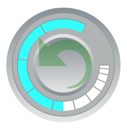 |
Dropdown List |
| Revsered Scale | Progression of the bar is to going from max to min value 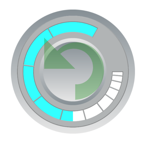 |
Dropdown List |
| Minimum Data Value | The minimum value for the circular progress bar to present. This value must be larger than the minimum value of the binding register. | Number Editor |
| Maximum Data Value | The maximum value for the circular progress bar to present. This value must be larger than the minimum value of the binding register. | Number Editor |
| Value Binding Register | Select a register of which value is to be shown by the progress bar. | Register Selector |
| Show Direction Guide | Show the progress bar’s direction arrow. This arrow is visible in the design panel only. | Checkbox |
| Center Location | Set the coordinate values for the center point | Alignment Selector |
| Alignment | Align the center location to the central point of this widget | Alignment Selector |
Style Setting
| Property | Description | Operation |
|---|---|---|
| Show Foreground Image | Enable the foreground image. If the image has opacity setting, then the progress bar is shown through the image. | Checkbox |
| Load Foreground Image | Load a image from the file system as the foreground | File Open Dialog Box |
| Rounded Endpoint | Check to make the end points of the progress bar rounded | Checkbox |
| Start Angle | Progres bar starting angle (0-359). Please refer to Number Editor for more details. | Number Editor |
| Arc Length | Progress bar length setting in degrees(1-359) | Number Editor |
| Arc Radius | Set the radius of the arc. The maximum value of the radius is determined by the size of the widget. | Number Editor |
| Arc Color | Select a color for the arc | Color Selector |
| Arc Width | Set the width of the arc (0-100) | Number Editor |
On-Widget Editor
| Property | Description | Operation |
|---|---|---|
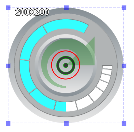 |
Adjust the center location | Center Editor |
Right-Click Menu
Move to Center
| Property | Description | Operation |
|---|---|---|
| Move to Center | Move the center of the progress bar circule to the centerl point of the widget | Center Editor |
Direction
| Property | Description | Operation |
|---|---|---|
| Direction | Set the progression direction to be clockwise or counter-clockwise |
Center Editor |
Widget-Specific Actions
| Property | Description | Operation |
|---|---|---|
| Edit Image | Edit the foreground image | Image Editor Dialog Box |
| Load Foreground Image… | Load an image from the file sytem as the foreground | File Open Dialog Box |
| Paste from Clipboard | Paste an image from Clipboard as the foreground | |
| Link to User Manual… | Connect to the education video and play it |