Link Search Menu Expand Document

Generic Gauge is an output widget.

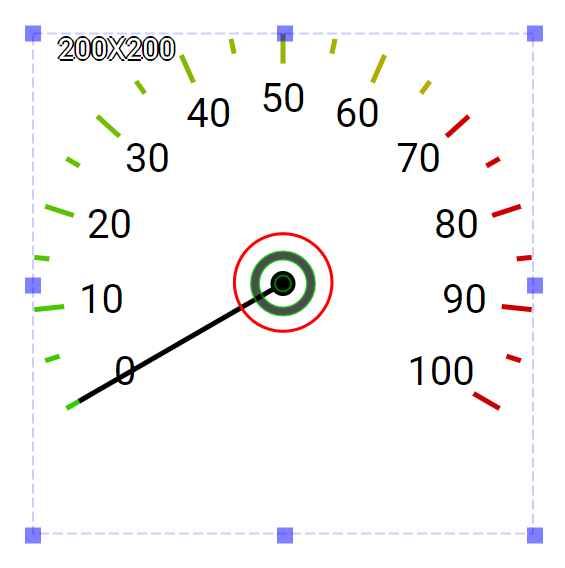
This widget offers an efficient and resource-thrifty way to dispay meters. The scales are symmeric and gradient colors can be used. This widget has a default needle which is rendered directly by the system. By doing so, this widget requies far less system resources. It is suitable for HMIs that need many gauges and the gagues need to reflect the change of the values quickly. This widget supports layering images and it can be layered upon other background images for enhancing visual effects.

An educational vidoe is availble to get users started:

  • Educational Video

Widget Property

Generic Gauge

Property Description Operation
Widget Name Widget displayed name Name
Link to User Manual Link to IOT’s website for User Manual  

Visibility Control

Property Description Operation
Binding Hidden Control Register Select a binding register to control the visibility of this widget Checkbox
Hidden Control Register Choose a binding regsiter Register Selector

Gauge Configuration

Property Description Operation
Minimum Data Value Set the minimum value for the scales Number Editor
Maximum Data Value Set the maximum value for the scales Number Editor
Critical Data Value Set the critical value when the tick’s color starts to change Number Editor
Start Angle Starting angle (0-179), please refere to Number Editor Number Editor
Tick Granularity Set the tick granularity(0-100) Number Editor
Sub Tick Granularity Set the sub tick granularity (0-20) Number Editor

Label Style Setting

Property Description Operation
Display Label Display labels Checkbox
Label Distance from Scale Line Set the distance between the lable and the scale as a percentage(0-100) of the radius Number Editor
Label Color Select a color for the labels Color Selector

Tick Style Setting

Property Description Operation
Tick Main Color Select a color as the major color for the ticks Color Selector
Tick Gradient Color Select a color as the gradient color for the ticks Color Selector
Tick Width Set the tick width(0-100) Number Editor
Tick Length Set the tick length(0-200) Number Editor
Tick Critical Color Set the critical color for the ticks Color Selector
Center Location Set the coordinate values for the center of the widget Alignment Selector

Needle Configuration

Property Description Operation
Radius Original Circle Set the radius of the circle around the centeral point. Users can set the radius to the maximum value and change the opacity for makeing this circle as the widget background. Number Editor
Origianl Circle Color Select a color for the original circle Color Selector
Enable Needle 1 Enable Needel 1 Checkbox
Needle 1 Binding Register Set the binding register for Needle 1. The needle starts with the minimum value of the binding register and change the angle according to the value of this register till the maximum value. Register Selector
Needle 1 Color Select a color for Needle 1 Color Selector
Enable Needle 2 Enable Needel 2 Checkbox
Needle 2 Binding Register Set the binding register for Needle 2. The needle starts with the minimum value of the binding register and change the angle according to the value of this register till the maximum value. Register Selector
Needle 2 Color Select a color for Needle 2 Color Selector
Enable Needle 3 Enable Needel 3 Checkbox
Needle 3 Binding Register Set the binding register for Needle 3. The needle starts with the minimum value of the binding register and change the angle according to the value of this register till the maximum value. Register Selector
Needle 3 Color Select a color for Needle 3 Color Selector

On-Widget Editor

Property Description Operation
Adjust the location of the center of the widget Center Editor

Right-Click Menu

Move to Center

Property Description Operation
Move to Center Move the center of the circle to the central point of the widget Center Editor

Widget-Specific Actions

Property Description Operation
Link to User Manual… Connect to the education video and play it