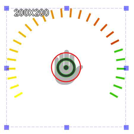
Circular Meter is an output widget. Its function is very similar to that of Circular Progress Bar. The scale of the widget must be symmetric. The scale comes with default colors and can use gradient color for presenting different segments. This widget can use to design a meter that shows a warning message at the high values such as a pressure meter.
An educational vidoe is availble to get users started:
Property
Description
Operation
Widget Name
Widget displayed name
Name
Link to User Manual
Link to IOT’s website for User Manual
Property
Description
Operation
Binding Hidden Control Register
Select a binding register to control the visibility of this widget
Checkbox
Hidden Control Register
Choose a binding regsiter
Register Selector
Property
Description
Operation
Minimum Data Value
The minimum value for the circular progress bar to present. This value must be larger than the minimum value of the binding register.
Number Editor
Maximum Data Value
The maximum value for the circular progress bar to present. This value must be larger than the minimum value of the binding register.
Number Editor
Start Angle
Progres bar starting angle (0-359). Please refer to Number Editor for more details.
Number Editor
Arc Length
Progress bar length setting in degrees(1-359)
Number Editor
Value Binding Register
Select a register of which value is to be shown by the progress bar. When the value of this register is at minimum, the widget shows the inactive color. As the value increases, the active clor is shown.
Register Selector
Property
Description
Operation
Inactive Segment Color
Select a color for the invactive segment
Color Selector
Active Segment Start Color
Select a color as the major color for active segment
Color Selector
Active Segment End Color
Select a color as the higher end color for the active segment
Color Selector
Tick Granularity
Select a tick granularity
Number Editor
Tick Width
Set the tick width
Number Editor
Tick Length
Set the tick length
Number Editor
Property
Description
Operation
Show Protractor
Show the protractor
Checkbox
Value
Set the data value for previewing
Number Editor
Property
Description
Operation
Adjust the center location
Center Editor
Property
Description
Operation
Move to Center
Move the center of the progress bar circule to the centerl point of the widget
Center Editor
Property
Description
Operation
Link to User Manual…
Connect to the education video and play it

