V2 Image Label is an output widget.
The purpose of using this widget is to display rich text, to display multi-languages or to display user-installed fonts. The contents of this widget must be given during the ADE design phase and they cannot change after the project is deployed to IOT products. This widget is suitable for creating text with user-preferred style for labels or indicators.
For learning how to use this widget, please take a look at our educational video:
Property
Description
Operation
Widget Name
Widget displayed name
Name
Link to User Manual
Link to IOT’s website for User Manual
Property
Description
Operation
Binding Hidden Control Register
Select a binding register to control the visibility of this widget
Checkbox
Hidden Control Register
Choose a binding regsiter
Register Selector
Property
Description
Operation
Enable Shadow
Enable shadow
Checkbox
Property
Description
Operation
Main Color
Select the main color for the background
Color Selector
Gradient Color
Select the gradient color for the background
Color Selector
Show Background Image
Show the background image or not
Checkbox
Load Image
Load an image as the background
File Open Dialog Box
Property
Description
Operation
Border Color
Select the color for the border
Color Selector
Border Style
Select the line style for the border
Dropdown List
Line Height
Set the spacing between text lines
Number Editor
Blending Mode
Select the color blending mode for the text and the background. Please refere to Blending Selector
Blending Selector
Property
Description
Operation
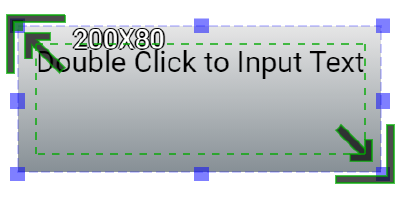
Double-click for entering text. Use Shift+Enter for inserting a new line
RichText Editor
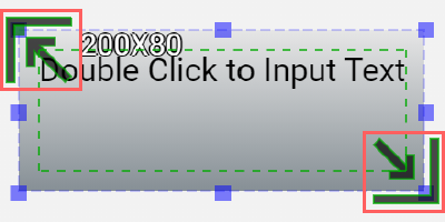
Adjust the size of the text box
Handle Editor
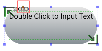
Adjust the radius of the background corners
Handle Editor
Property
Description
Operation
Enable Shadow
Enable Shadow
Checkbox
Property
Description
Operation
Remove Border
Remove all borders and set the border line width to 0
Make Squared
Choose a larger value between the width and height and use it to change the widget shape to a square
Link to User Manual…
Connect to the education video and play it