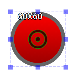
LED is an output widget.
This widget is to emulate the behavior of the physical LEDs. It can be set as on/off mode or analog mode for brightness.
An educational vidoe is availble to get users started:
LED
| Property |
Description |
Operation |
| Widget Name |
Widget displayed name |
Name |
| Link to Educational Video |
Link to IOT’s website for Educational Video |
|
Visibility Control
| Property |
Description |
Operation |
| Binding Hidden Control Register |
Select a binding register to control the visibility of this widget |
Checkbox |
| Hidden Control Register |
Choose a binding regsiter |
Register Selector |
Behavior Setting
| Property |
Description |
Operation |
| Value as Brightness |
Use the value of the binding register to set the brightness |
Checkbox |
| Toggle/Brightness Binding Register |
Select a binding register for the toggle mode (on/off) or as the indicator for brightness (0-255) |
Register Selector |
Body Setting
| Property |
Description |
Operation |
| Show Center Handler |
Show Center Handler |
Checkbox |
| Main Color |
Select a main color |
Color Selector |
| Gradient Color |
Select a gradient color |
Color Selector |
| Body Opacity % |
Set the widget body opacity(0-100%) |
Number Editor |
| LED Shape |
Select a LED shape |
Dropdown List |
| Corner Radius |
Set the corner radius; only valid when the LED shape is set to Rectangle |
Number Editor |
Border Setting
| Property |
Description |
Operation |
| Border Color |
Select a border color |
Color Selector |
| Border Opacity % |
Set the border opacity (0-100%) |
Number Editor |
| Border Width |
Set the border width. The maximum value varies according to the size of the widget. |
Number Editor |
Shadow Setting
| Property |
Description |
Operation |
 |
Adjust the center of the widget |
Center Editor |
Move to Center
| Property |
Description |
Operation |
| Move to Center |
Move the center of the circle to the central point of the widget |
Center Editor |
| Property |
Description |
Operation |
| Link to Educational Video… |
Connect to the education video and play it |
|

