Gradient Graphic

For learning how to use this widget, please take a look at our educational video:
-
Educational Video
Widget Property
Gradient Graphic
| Property | Description | Operation |
|---|---|---|
| Widget Name | Widget Displayed Name | Name |
| Link to User Manual | Link to IOT’s website for User Manual | |
| Center Location | Set the coordinate values for the center | Alignment Selector |
Background Setting
| Property | Description | Operation |
|---|---|---|
| Graphic Type | Select the shape for the gradient graphic | Dropdown List |
| Radus Origin Circle | Set the radius for the circular gradient graphic | Number Editor |
| Gradient Mode | Select the gradient mode | Dropdown List |
| Main Color | Select the main color | Color Selector |
| Gradient Color | Select the color for the gradient effect | Color Selector |
| Show Background Image | Show the background image or not | Checkbox |
| Blending Mode | Select the blending mode for blending this widget with the background image. Please refer to Blending Selector | Blending Selector |
Border Setting
| Property | Description | Operation |
|---|---|---|
| Border Color | Select a color for the border | Color Selector |
| Border Style | Select a line style for the border | Dropdown List |
Shadow and Light Source Control
| Property | Description | Operation |
|---|---|---|
| Enable Shadow and Light Source | Enable the effects of shadow and light source | Checkbox |
| Shadow Dx | Set the X-axle coordinate for the shadow | Number Editor |
| Shadow Dy | Set the Y-axle coordinate for the shadow | Number Editor |
| Alpha Channel Linear Mapping Slope | Set the transparency for the shadow | Number Editor |
| Light Surface Scale | Set the height of the surface for reflecting the light | Number Editor |
| Light Specular Constant | Define the surface for reflecting the light. Zero for no reflection | Number Editor |
| Light Specular Exponent | Define the focus of the light source. The larger number the less focused | Number Editor |
| Light Color | Set the color for the light source | Color Selector |
| Light Source X | Set the X coordinate for the light source | Number Editor |
| Light Source Y | Set the Y coordinate for the light source | Number Editor |
| Light Source Z | Set the Z coordinate for the light source | Number Editor |
On-Widget Editor
| Property | Description | Operation |
|---|---|---|
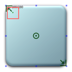 |
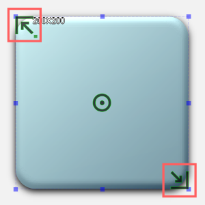
Adjust the radius for the corners | RichText Editor |
 |
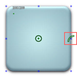
Adjust the linear gradient’s main color and its location | Handle Editor |
 |
Adjust the radial gradient’s main color and its location | Handle Editor |
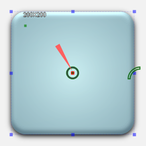 |
Adjust the location for the center of the radial gradient | Handle Editor |
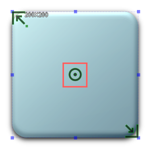 |
Adjust the location of the center of the circle | Handle Editor |
Right-Click Menu
Widget-Specific Actions
| Property | Description | Operation |
|---|---|---|
| Link to User Manual… | Link to IOT’s website for User Manual | |
| Remove Border | Remove the border | |
| Make Squared | Make the widget a square by choosing the larger number between the width and the height of the widget as the edge | |
| Reset to Original Size | Reset the widget to its default size | Reset Editor |
| Edit Image | Launch the image editor | Image Editor Dialog Box |
| Load Image… | Load an image from the file system | File Open Dialog Box |
| Paste from Clipboard | Paste an image from Clipboard |